Using Machine Learning to Explain Credit Ratings
We explore how machine learning can be leveraged to better understand the drivers behind credit ratings of public companies.
Credit ratings play a crucial role in the financial world. They help lenders, investors, and other stakeholders make informed decisions about the credit risk associated with a specific borrower or investment.
Credit rating agencies such as Moody’s, S&P, and Fitch, regularly gauge the creditworthiness of individual firms, and their issued securities, to help guide investors in making decisions.
These rating agencies employ many factors in determining their ratings. For example, they examine factors such as financial statements, industry position, and the broader economic climate. Key aspects also include the issuer’s balance sheet, profit outlook, competition, and management quality.
While the rating agencies, for example, Moody’s, do publish the methodology surrounding their credit rating analysis, these methodologies, which consider both quantitative and qualitative factors, can be quite complicated to draw inferences from.
For example, what variables were the most important in determining the credit rating? How much does each variable inform the credit rating of any given firm? How does the probability of a rating depend on how these variables change?
This article aims to set up a simple model that illustrates how an ML model, coupled with standards approaches to model “explainability,” can be employed to illustrate the broad impacts different variables can have on influencing a given firm’s credit rating.
The idea here is that we can leverage an ML model to generate a simpler understanding of why a given firm’s credit rating is what it is, irrespective of the complex methodology the rating agency purports to use, saving time and effort in deciphering those methodologies.
Experimental Approach
For this exercise, the target variable of the model will be the credit rating assigned to the overall firm. The universe of firms is US exclusive, with no restriction set on the characteristics of their equity, other than that we must have access to their financials, and market data.
Our explanatory variables (i.e. ML model features) are drawn from our in-house AlphaLayer factor library, which contains over 100+ factors covering different styles and data sources, from fundamental financial data, to market data signals, to sentiment, etc.
The target credit rating data is set in a way that at the end of every month, whether or not the credit rating has changed within that month, we have a credit rating label assigned to each firm. The feature data is daily, and so we take the average value of the features for each month. We fit the model on monthly data going back almost 20 years.
The ML model we use is XGBoost, a gradient boosting model, which has shown good performance in many examples, especially those employing tabular data, as is the case in this example.
Given the large number of possible credit ratings, we map the ratings in the following way:
Bucket 0: ['AAA', 'AA+', 'AA', 'AA-', 'A+', 'A', 'A-', 'BBB+'], 83136 observations
Bucket 1: ['BBB', 'BBB-', 'BB+'], 77976 observations
Bucket 2: ['BB', 'BB-', 'B+'], 64786 observations
Bucket 3: ['B', 'B-', 'CCC+', 'CCC', 'CCC-', 'CC', 'SD', 'D'], 27793 observations
So higher-numbered buckets are composed of worse-rated firms. Going forward, we refer to these buckets respectively as: high grade, medium, low, and junk.
For reference, here’s the distribution of the actual ratings for our data set. Recall that we have a rating for each firm, each month, irrespective of whether or not that rating changed that month.
Examining the Feature Data
First, it is interesting to examine some of the underlying features from our factor library, for each credit rating bucket.
In each of the following charts, we plot the average value of the feature, across firms in each target credit rating bucket, as defined above. Moreover, these are the raw versions of the features, that help us understand their underlying characteristics, before being Normalized in the cross-section each month.
First, let’s look at how the size of the firm affects the target credit buckets. Here the Size feature is equal to -log(market_cap), so the less negative the value, the smaller the firm. Therefore, we see that smaller firms on average tend to have worse credit ratings.
Another interesting example is our feature SI_short_interest_percent_equity_float, which is the short interest percentage of the float. Here we see that generally speaking, worse-rated firms tend to exhibit higher short interest.
However, many features exhibit relationships to the credit ratings class buckets, that aren’t immediately obvious but yet tend to be quite important for the later model we’ll fit.
One example is our Aroe feature which represents the 3-year running average of return on equity. Here we can see that generally, better-rated firms exhibit a more stable return on equity across time, and that more poorly rated firms exhibit more volatility across time in the return on equity. This volatility is a 2nd order nonlinear effect apt to be captured by our ML model.
Model Results
We fit the model on the majority of the historical data, leaving a hold-out-set more recently to validate the model results. The features are all transformed to be standard Normal each month in the cross-section of securities, to avoid the influence of trends in the feature variables. Finally, we use balanced sample weights in the model training to account for the different class sample imbalances.
The following results are based on the hold-out test set of thousands of data points that the model has never seen.
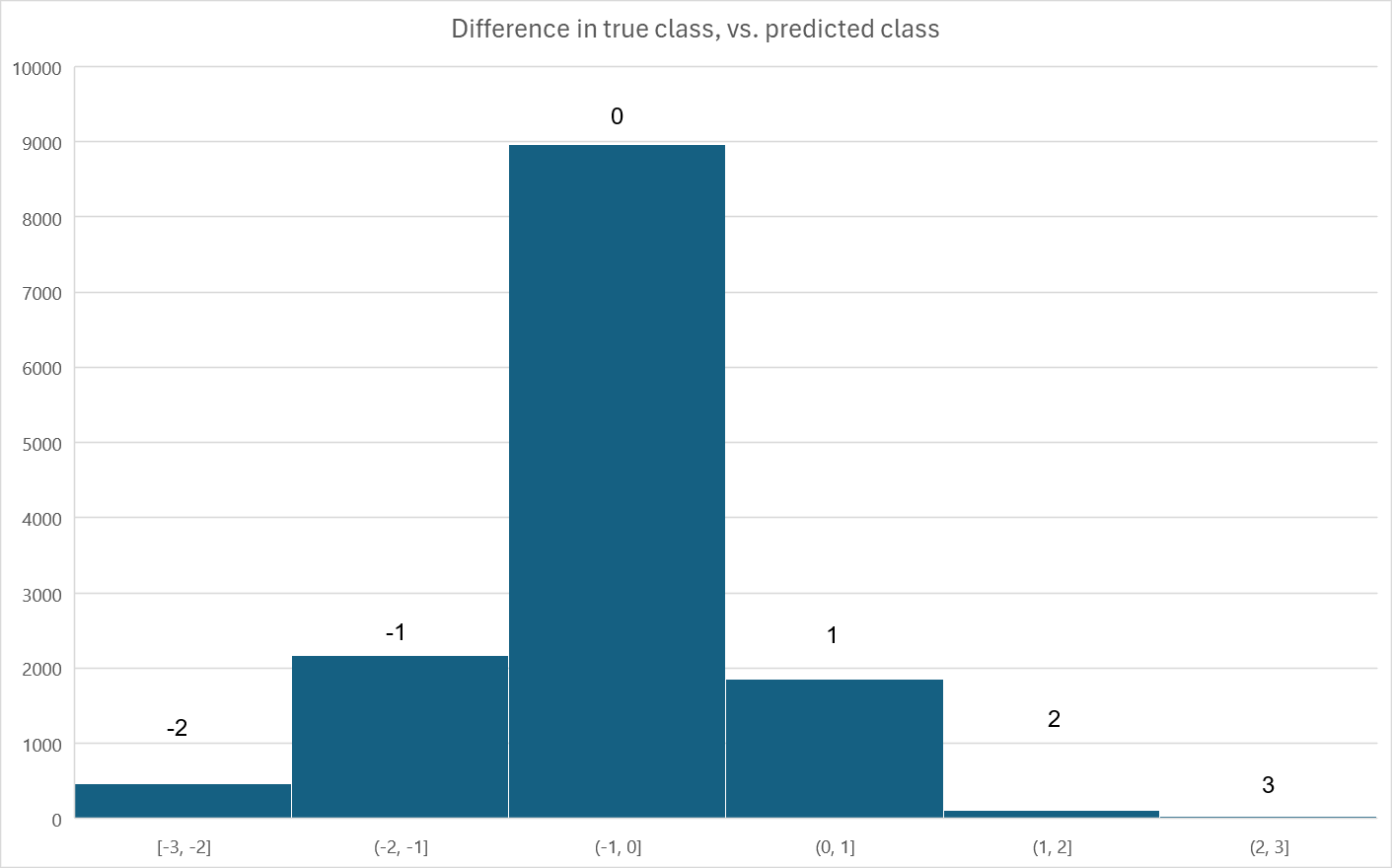
First, the model fits the out-of-sample data quite well. What follows is a histogram of the model errors: that is, the difference between the true credit rating bucket label, and the predicted bucket label. The vast majority of predictions are correct, and the overall correlation between the true labels and the predictions is 76.4%.
As further evidence we illustrate the recall and precision confusion matrices, which tell us for each target credit rating bucket class:
If the rating was truly X, how often did we predict X?
If we predicted X, how often was our prediction correct?
Noting that randomly guessing would roughly allocate a 25% chance to each class.
Finally, the certainty histograms, and reliability plots both suggest a well-fit model. Moreover, we generally have pretty good faith in the probability of our predictions, while simultaneously we exhibit a higher probability of predicting a class, given its frequency in the data.1 In particular we have very high confidence in the bulk of the high_grade class predictions.
Model Explainability
Given that we have an ML model able to predict the majority of historical credit ratings out-of-sample, how can we explain:
Which features are most useful in general to the model?
Is the assigned credit rating given any individual example?
The average response of the probability of a credit rating, to changes in the underlying features?
Features useful to the model in general (Feature importance)
We appeal to the tree-based feature importance associated with XGBoost to answer the first question. This feature's importance is based on how important a feature is to the trained model’s ability to split the tree and reduce the model’s error. See the accompanying footnote for descriptions of each feature.2
Unsurprisingly, features based on firm size, like Size and Dastd are most important.
Moreover, firm financials are highly informative, like Etop, Aroe, Egro, etc. The only features that show up as highly important that aren’t firm financial related are Dastd, Short Interest, Beta, Rstr, and Roc. These features are related to either the size of the firm, in the case of Dastd, information coming from traders, such as Short Interest, or market price dynamic-based features like Beta, Rstr, and Roc.
Interpreting any given credit rating prediction according to the contribution of each feature (SHAP)
In interpreting the assigned credit rating of any given firm, we can appeal to SHAP values. SHAP (or Shapley values) use a game theoretic approach to assign weight to each of the features in terms of their contribution to any given prediction. Essentially, they are a useful way to understand what features contributed to the overall prediction, and in what direction and magnitude.
As an example, in our out-of-sample dataset, we find that we correctly predict AAPL as having a bucket 0 credit rating (the best rating class, recalling that lower number buckets are more highly rated).
To understand this prediction we generate the SHAP plot as follows.
Some interesting items of note here:
Positive SHAP values are features that influence the prediction in the direction of a lower credit rating. Negative SHAP values influence the prediction in the direction of a better credit rating. This is because lower indexed buckets (i.e. 0) are better rated.
Size is by far the largest contributor to our rating prediction. Size represents an exception to the comment above, because of the negative sign in the construction of the factor (see footnote 2). Since the Size feature is negatively signed (i.e. smaller firms have larger size values), this strong positive SHAP value for Size suggests that AAPL, being a firm with a large market cap valuation, is contributing heavily to its better credit rating.
Conversely, we also include a random noise feature in our model as a reference point to gauge the value of other features. We can see that random_noise_0 has no contribution to the overall prediction.
Contributing in the direction of a worse credit rating is Log_dtoa which is the log(debt/assets) ratio. That is, having more elevated debts relative to assets is pushing in the direction of a lower credit rating for AAPL.
Beyond the features discussed above, many other features contribute to the overall prediction of the final credit rating prediction assigned, which was, in this case, correctly assigned, on this date, as bucket 0.
In each case, we can interpret the individual SHAP values for each feature as the contribution, to the overall probability, that AAPL’s credit rating is in bucket 0.
Therefore, if we sum up all the SHAP values, this is equal to the overall probability that the model believes AAPL is in bucket 0 on this date, and the probability is roughly 75%.
45% of this probability is due to Size and the rest is due to the cumulative effects of the other features.
The average response of the probability of a credit rating prediction to changes in the value of a feature (PDP/ICE)
To interpret the average response of the probability of a given credit rating, arising from changes in a given feature, we can appeal to PDP and ICE. PDP stands for Partial Dependency Plot, and ICE stands for Individual Conditional Expectation. 3
ICE plots represent the individual contribution to the model’s prediction, of a given feature, for a specific predictive observation, holding all other features constant. In this way, they are similar to the SHAP values given above. They differ, however, in that they show us how, as the feature value changes, the probability of the prediction changes. In this sense, you can think of them as the nonlinear ML equivalent of OLS regression slope coefficients.
A PDP plot is essentially the average of all ICE plots for a given feature, where the average is taken across all observations. What this means is the PDP plot tells you “on average,” across different random observations of features, how the probability of your prediction varies as the feature itself changes.
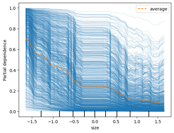
Size (credit rating target class 0)
Following in our example above, let’s first focus on Size. Recall that in our model we transform all features to be standard Normal, cross-sectionally across firms, each month.
Each blue line above is an out-of-sample predictive observation where the target prediction was class 0. In each observation, the values of the features are different. These blue lines are therefore the ICE plots for Size, prediction class 0.
Note that in some rare cases, increasing Size (i.e. being a smaller firm) doesn’t dramatically decrease the probability of the prediction being class 0 (for example the very top blue line). But on average (i.e. the orange dotted line), across all observations, we can see that the general contribution of a larger Size is a lower probability of class 0. That is, being a smaller firm tends to dramatically increase the probability that your rating will not be in the highest class, from 70% for the larger firms, down to around 10% for the smaller firms. This average, orange dotted line, is the PDP plot.
One other thing to note is that the variation of probabilities across the ICE plots is much greater than the variation of the PDP plot. In other words, while the blue lines trace out probabilities across the x-axis, the range of each ICE plot across the y-axis, varies much more across ICE plots, than the PDP plot itself varies across the y-axis. This tells us that the contribution of the other features matters a lot to the overall prediction, beyond just Size.
Given that we now understand how to interpret ICE & PDP plots, let’s take a look at some other interesting ones.
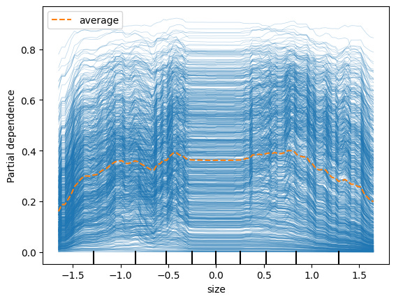
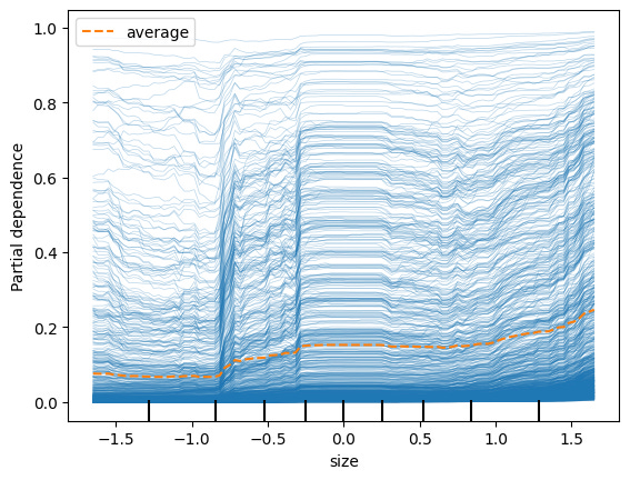
Size (credit rating target classes 1, 2, 3)
Interestingly, we see that for Size, the probability of target class 1 (2nd highest bucket of credit ratings), is much higher for firms in the middle of the Size distribution.
And for rating target classes 2 & 3, being a smaller market cap firm increases your probability.
For the final target class 3, we see that it rises less as the firm gets smaller than say for target class 2. This suggests that for the very worst-rated firms, other factors contribute a lot to the rating beyond just their size.
Random Noise
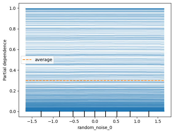
We see that the probability that the prediction is class 0 doesn’t depend at all on random_noise_0 feature, as expected. (The plots for the other classes, 1,2,3, look the same as well; on average the PDP plot probability is close to 25%, that is, no better than assignment via random chance).
Earnings Surprise (credit rating target class 3)
Perhaps one of the most mysterious results is for the firms with the worst credit rating prediction, target class 3. In this case, having a small, or zero, EPS surprise actually increases the probability of being poorly rated. This is something that a linear model like OLS would have trouble identifying.
Conclusion
In conclusion, we’ve shown how you can build an ML model that both predicts and explains, credit ratings at any given time, based on several common accounting and market data-based features.
Moreover, we do this in a relatively simple way, that accurately explains credit ratings based on historical data, without having to appeal to a complex rating agency methodology.
Using techniques from the ML “explainability” toolbox, including feature importance, SHAP, and PDP/ICE plots, we show how to understand the contribution of each model feature to both any given prediction, as well as all the predictions on average.
Next, we’ll tackle how to use a similar modeling framework to try and predict:
When a credit rating will see a change
Will the credit rating change be an improvement or a downgrade?
How large will the credit rating change be?
Until next time…
The strange dip in the reliability plot for the third low class is likely due to a small sample issue and not indicative of a model deficiency.
Size: -log(market_cap)
Dastd_21_10000_21: 21-day trailing window, daily stock return volatility
Etop: Earnings-to-price: trailing 12-month earnings divided by current market_cap
Aroe: 3-year average return on equity
Stom: log of the sum of daily turnover for the past 21 days
Egro: earnings growth, computed as the slope coefficient of earnings per share, regressed against time, over the past five years, divided by current absolute earnings per share
Ffo_alt: a modified version of funds from operations
Log_dtoa: log(debt / assets); i.e. log debt-to-assets ratio
Atltm: Asset turnover ratio, last 12 months
Ebitrts_etr: tax expenditures divided by EBIT
Si_short_interest_equity_float: Short interest as a percentage of equity float
Ar_Z_eps_last_period_surprise_pct: Z={Annual, Quarterly} EPS, percentage surprise, quarter over quarter
Btop: Book-to-price: Book value of common equity divided by market_cap
Beta_252_63_21: CAPM Beta, 252-day EWMA window, 63-day half-life, 21-day lagged returns
Yoypt_epsdil_shiftX: Year-over-year percentage change in EPS, shifted by X quarters
Ar_Z_eps_num_of_negative_surprises_window_Y: Z={Annual, Quarterly} EPS, number of EPS surprises that were negative, in a Y period lookback window
Ebitrts_deda: Debt-to-EBITDA ratio
Ebitrts_der: Debt-to-EBIT ratio
Rstr: Momentum, 504-day EWMA window, 126-day half-life, 21-day lagged returns
Si_days_to_cover: Short interest days to cover
Ffo: Funds from operations
Fcfv: Free-cash-flow divided by enterprise value
Roc_21: 21-day price return
Syild: Shareholder yield, composed of dividend yield, net-repurchase yield, and debt-reduction yield
It’s advised that if the features in a model are highly correlated, PDP plots can generate misleading results. In our case, the vast majority of features exhibit relatively low correlation to each other, so any bias in our PDP plots is likely to be minimal.
If your features consistently exhibit high correlations with each other, it’s advisable to use a different approach, such as ALE (or Accumulated Local Effects). See Molnar, Chapter 8.2, for more details: Molnar, 2023, "Interpretable Machine Learning"


